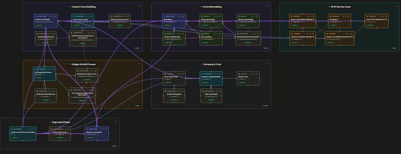
An internal link map is a visual graph of your website where every page is a node and every internal link is an edge between two nodes. Instead of reading links as rows in a crawl export, you see the actual shape of the site, which pages collect authority, which pages sit stranded, and where the gaps are. If you are doing this across a roster, our guide to auditing internal links across 20 client sites shows how to keep the map from turning into a one-off project.
That shape is the whole point. Most internal linking problems are structural, and structural problems are close to invisible in a spreadsheet. This guide covers how to build a link map, how to read one, and how to turn what you find into a linking plan you can execute this week. If you want to see how that planning works before a draft exists, see our guide to content mapping for SEO: turning topic clusters into an internal linking plan.
What Is an Internal Link Map?
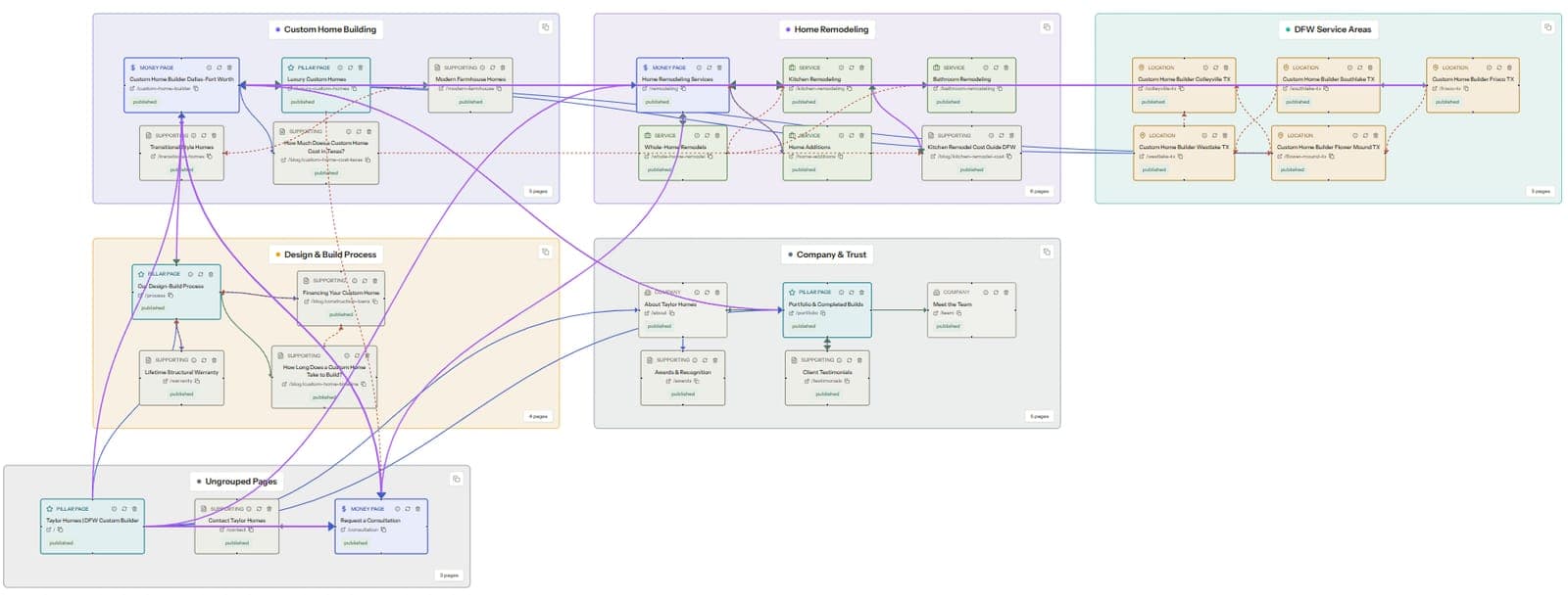
A link map, sometimes called a link graph, is a network diagram of a site's internal links. Pages are nodes. Links are directed edges, meaning each one points from a source page to a target page. Direction matters because a link passes relevance and authority one way. That same source-to-target view is what makes internal link testing workable, since you can pick the exact source pages that send links to one target and measure the change later.
Lay the nodes and edges out visually and patterns appear in seconds. Blog clusters show up as tight knots. Money pages either sit at the center of those knots or float alone at the rim. A page with zero inbound edges is an orphan, and you will spot it faster on a map than in any report.
A link map is a diagnostic layer on top of your linking strategy, so it assumes you already know why internal links matter. If you need the foundations first, start with our complete guide to internal linking strategy, then come back. This post is about seeing the structure you actually have.
Why Spreadsheets Fail for Link Planning
The standard workflow is a crawl export. You run a crawler, open the inlinks report, and get a sheet with source URL, target URL, and anchor text. A 300-page site with 50 links per page produces 15,000 rows.
Rows prove that links exist. They cannot show structure. You cannot look at row 4,081 and know whether the target is a well-linked hub or a dead end. You cannot see that two related clusters never link to each other at all.
Spreadsheets also flatten link quality into counts. A pivot table can tell you a page has 12 inbound links, and that count is useful for triage. But 12 links from thin tag pages and 12 links from your highest-traffic guides are completely different situations. Only a map shows which one you have.
The deepest failure is planning. To decide where new links should come from, you need to see candidate source pages sitting near the target by topic. On a map, related pages cluster together and the missing edges between them are visible gaps. In a sheet, finding them takes memory and guesswork.
How to Build an Internal Link Map
You need three inputs. A full crawl, a way to turn the crawl into a graph, and topic labels for the nodes. Here is each step.
Step 1: Crawl the site
Crawl every indexable page with any crawler that exports source and target URLs for internal links. Screaming Frog and Sitebulb both handle this well on the desktop side. Configure the crawl to respect canonicals and to flag noindexed pages rather than drop them, because a noindexed page that hoards internal links is exactly what you want the map to surface.
Decide scope before you hit start. Include blog posts, service or product pages, and category pages. Exclude parameter URLs, paginated archives beyond page one, and boilerplate targets like login and cart pages. Leave those in and they dominate the graph and bury the signal.
This crawl doubles as the raw data for a structural audit, and the two workflows share most of their steps. We wrote the checklist version in how to audit your website's internal link structure if you want the full process.
Step 2: Turn the crawl into a graph
Export the edge list, a two-column table of source and target URLs. Feed it to a graph tool. Gephi is the free option and handles thousands of nodes, though the learning curve is real. Screaming Frog's built-in force-directed diagrams work for a quick look but get cluttered past a few hundred pages.
Use a force-directed layout. It pulls densely linked pages together and pushes weakly connected pages to the edge, so topical groups form on their own without manual arranging. Size each node by its count of inbound internal links. Big nodes are your hubs, tiny nodes at the rim are your problems.
Step 3: Cluster and label pages by topic
A raw graph shows structure without meaning. Add meaning by grouping nodes by topic, using URL folder rules, title keyword rules, or manual tagging on smaller sites. Give each cluster a color.
Now the map answers real questions. Does the water heater cluster link into the water heater service page? Is the pillar post actually at the center of its cluster, or is a random 2019 post holding that spot?
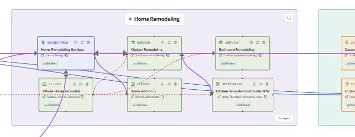
Color earns its keep on the cross-cluster questions, like whether two adjacent clusters connect anywhere at all. Those gaps hide in any report and jump out of a colored graph.
How to Read a Link Graph
Building the map is mechanical. Reading it is the skill. Five patterns cover most of what you will find.
Hubs
Hubs are the large nodes with many inbound and outbound edges. On a healthy site, the pillar pages and top commercial pages are the hubs. On many real sites, the biggest hubs turn out to be the homepage, the contact page, and a category archive, while the pages that earn revenue hang near the rim.
Ask two questions of every hub. Does it deserve the authority it collects, meaning is it a page you want ranking? And does it pass authority onward to pages that matter, or do its outbound links all point at boilerplate?
Orphans and near-orphans
An orphan has zero inbound internal links and appears as an isolated dot, if the crawler found it at all through the sitemap. Near-orphans have one or two weak inbound links and hang off the edge of the graph. Both are common on sites where content shipped for years without a linking step.
Orphans are usually the highest-ROI fix on the entire map, because the repair is cheap and the upside is immediate. We covered the full workflow, from detection through prioritization, in how to fix orphan pages fast.
Dead ends
A dead end receives inbound links and sends nothing onward. Old campaign landing pages, converted PDFs, and posts written before the blog had anything to link to are the usual suspects. Dead ends waste the authority they collect, and they strand both crawlers and readers.
The fix takes minutes per page. Add two to four contextual links from the dead end into related pages, and point at least one at a page you want to rank. Also watch for clusters that are dead ends collectively, groups that receive links from the rest of the site and return nothing.
Cannibal clusters
A cannibal cluster is a group of pages on one topic all competing for the same query. On the map it looks like a tight knot with no clear center. Links inside the knot point in every direction, and the anchors usually repeat one phrase across different targets, so search engines get no signal about which page is canonical for the topic.
Fix it by electing one primary page, pointing the cluster's links at it, and differentiating the anchors. Anchor text carries more of this signal than most people expect. Our post on anchor text best practices covers how to vary anchors without going vague.
The overall shape
Zoom out before you fix anything. A site with tight, well-separated clusters connected through pillar pages is running a silo structure. A site where everything links to everything is flat. Both can work, and the right choice depends on size and topical breadth, which we compared in silo versus flat site architecture.
The map tells you which structure you actually have, as opposed to the one in the strategy doc. Most sites that believe they run silos turn out to run an accidental flat structure with extra steps.
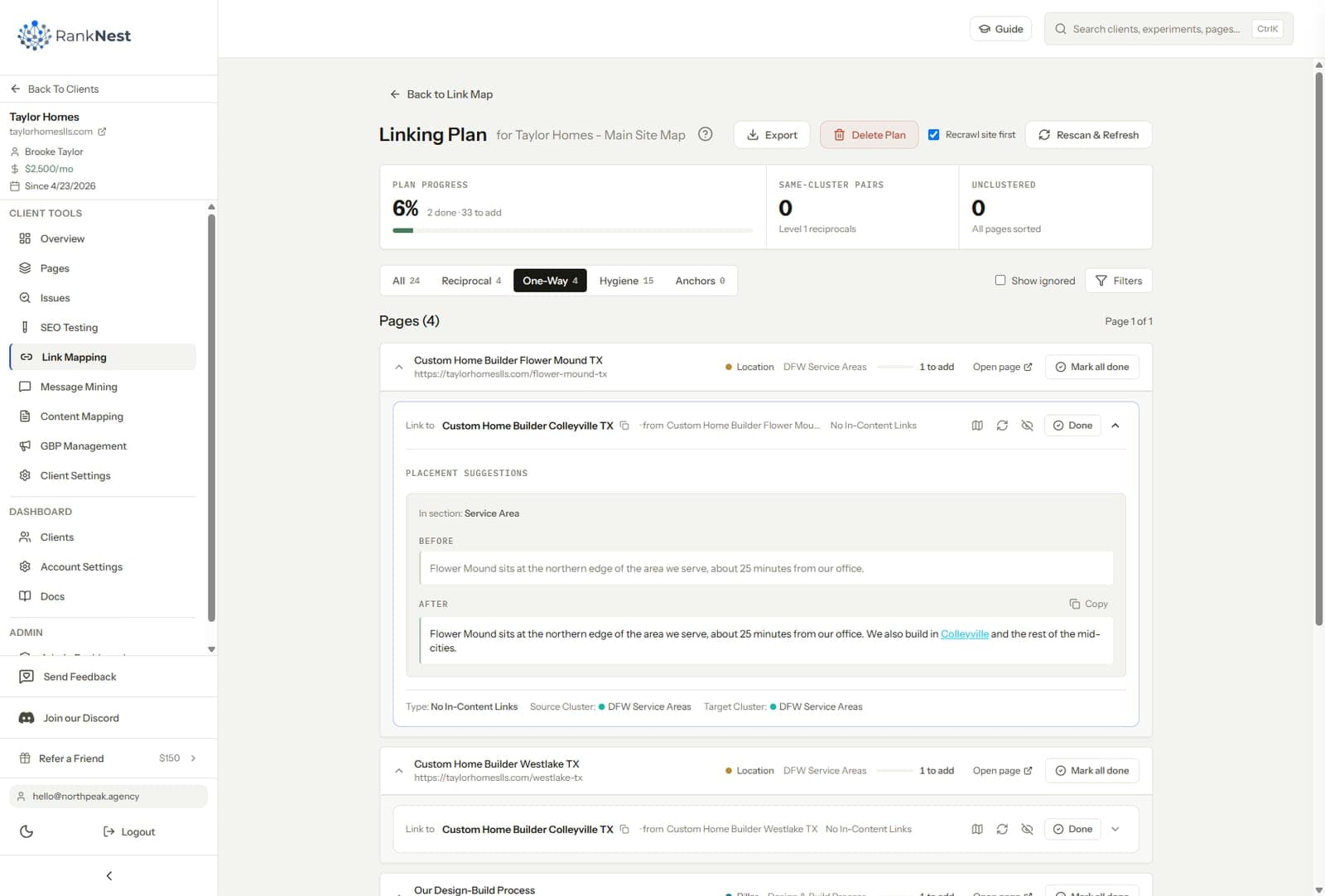
Turning the Map Into a Prioritized Linking Plan
A map full of findings is still just a picture. The output that matters is an ordered list of links to build, each row with a source page, a target page, and a suggested anchor. Here is how to get from one to the other.
Score target pages first. A target earns priority when it has commercial or strategic value and ranks between positions 4 and 15 for a query with real volume. The third condition is that the map shows it under-linked relative to its cluster. Pages that tick all three boxes go to the top of the plan.
Then pick sources for each target. Good sources sit in the same topical cluster, carry inbound authority of their own, and already mention the target's topic somewhere in the body. The map hands you these visually. They are the near neighbors with no edge to the target.
Write the anchor into the plan while the context is fresh. Deciding anchors at build time produces the same phrase 30 times. Deciding them at planning time, with the source paragraph in front of you, produces natural variation.
Then cap the plan. Ship 10 to 30 links per cycle, measure, and plan the next batch. A 400-row linking plan gets ignored, a 20-row plan gets done this week. Small batches also make the impact measurable, which turns linking from a hygiene task into evidence you can put in front of a client or a boss.
A worked example
Say a plumbing client's map shows the tankless water heater service page at position 9, with two inbound links, both from the homepage footer. The blog has six tankless-related posts forming a visible cluster, and none of them link to the service page. That is the entire diagnosis, read straight off the graph in under a minute.
The plan writes itself as six rows. Each blog post links once to the service page with a distinct, descriptive anchor, and the service page gets one outbound link back into the strongest post. Total build time is under an hour in the CMS. That single batch is also a clean, measurable experiment, which is a topic we will return to in a later post.
Internal Link Mapping Tools
You can assemble a mapping workflow from parts, or use something built for the job.
- Screaming Frog crawls the site, exports the edge list, and draws basic force-directed diagrams that hold up on small sites.
- Sitebulb produces crawl maps with cleaner visuals and audit hints layered on top.
- Gephi turns any edge list into a full interactive graph for free, with the steepest setup of the group.
- Octopus.do and similar sitemap planners draw intended hierarchy, which helps when planning a new site but says nothing about the links that actually exist.
- RankNest, our platform, crawls a site into a node-based visual link map, then generates a prioritized list of internal links to build next when you click Generate. It was built for agencies running this workflow across a whole client roster, so every client keeps a live map instead of a quarterly export.
The honest selection rule comes down to volume. Mapping one site once, use the free parts. Mapping many sites on a schedule, use a tool that keeps each map current without repeating the setup.
Common Internal Link Mapping Mistakes
- Mapping every URL, parameters and archives included, which turns the graph into hairball soup. Scope the crawl first.
- Chasing raw link counts. A page does not need 40 inbound links, it needs a handful from the right hubs in the right cluster.
- Building the map once and never updating it. A map from March is fiction by August on any site that publishes weekly.
- Ignoring template links. On large sites most edges come from navigation, footers, and product grids, so the template level matters more than any single contextual link. Our guide to internal linking for massive e-commerce sites covers that scale.
- Fixing links without recording what shipped and when. If you cannot say what changed last month, you cannot connect the map to results.
Keeping the Map Current as Content Ships
A link map decays at the speed of your publishing calendar. Every new post starts as a node with zero inbound edges, and every new post is also a fresh source of outbound links to older targets. Both directions need a step in the workflow.
The simple version is a two-line addition to the publish checklist. Before a post goes live, pick 2 to 4 existing pages that will link to it, and add 2 to 5 outbound links from the new post into its cluster. Then recrawl on a schedule that matches output, monthly for a weekly publisher, quarterly for slower sites.
Agencies need one more layer, the same cadence repeated per client without paying the setup cost each time. That is an operations problem as much as an SEO problem, and it sits at the center of how we think about scaling SEO across multiple clients. Mapping pays off at agency scale when the recrawl, the delta check, and the next linking batch run as one standing monthly block per client.
FAQ
What is an internal link map in SEO?
An internal link map is a visual network diagram of a website where pages are nodes and internal links are directed edges between them. It exposes the structural patterns a crawl export hides, including hubs, orphan pages, dead ends, and disconnected topic clusters. SEOs use it to diagnose site structure and decide which internal links to build next.
How do I visualize my website's internal links?
Crawl the site with a tool like Screaming Frog, export the inlinks report as a source-and-target edge list, and load it into a graph tool like Gephi using a force-directed layout. Size nodes by inbound link count and color them by topic cluster. Purpose-built platforms skip the export step and draw the map directly from a crawl.
What is the difference between a link map and a sitemap?
A sitemap lists the pages you want crawlers to discover, with no information about how they connect. A link map shows the actual connections, every internal link from page to page across the site. A site can have a flawless XML sitemap and a broken link graph at the same time.
How many internal links should a page have?
No fixed number works across all sites. As a working rule, every page should hold at least 3 to 5 inbound internal links from topically related pages, and important commercial pages should hold far more. Relevance and source quality matter before raw counts do.
How often should I update an internal link map?
Match the recrawl cadence to publishing volume. A site shipping several posts a week should recrawl monthly, while slower sites hold up fine on a quarterly rhythm. The map matters most right after content ships, because new pages sit as near-orphans until someone builds links to them.
Can Google see my internal link structure the way a link map shows it?
Yes, crawlers experience your site as a graph of links, which is exactly what the map draws. Pages that are many clicks deep or weakly linked get crawled less often and carry less internal authority. The map is the closest view you can get of the structure a crawler actually navigates.